TRADE COFFEE
As a senior product designer on the Trade team I worked with product managers, engineers, marketers, copy writers, and leadership to iterate on their web platform. I led product design across many of the company’s growth initiatives as well as created a design system to help design scale across teams.
Jump to:
Sign Up Flow Conversion →
Design System →
Sign Up Flow Conversion
Rebuilding Trade's multiple subscription sign up flows into a single, flexible experience.
Trade had five different experiences for customers to purchase a subscription. Most of these flows were years old, inconsistent in UX, and challenging for customers. These inconsistencies also made it difficult to iterate on these experiences to achieve Trade’s new growth goals. For the customer, it created an overly complex and confusing experience without a clear path forward.
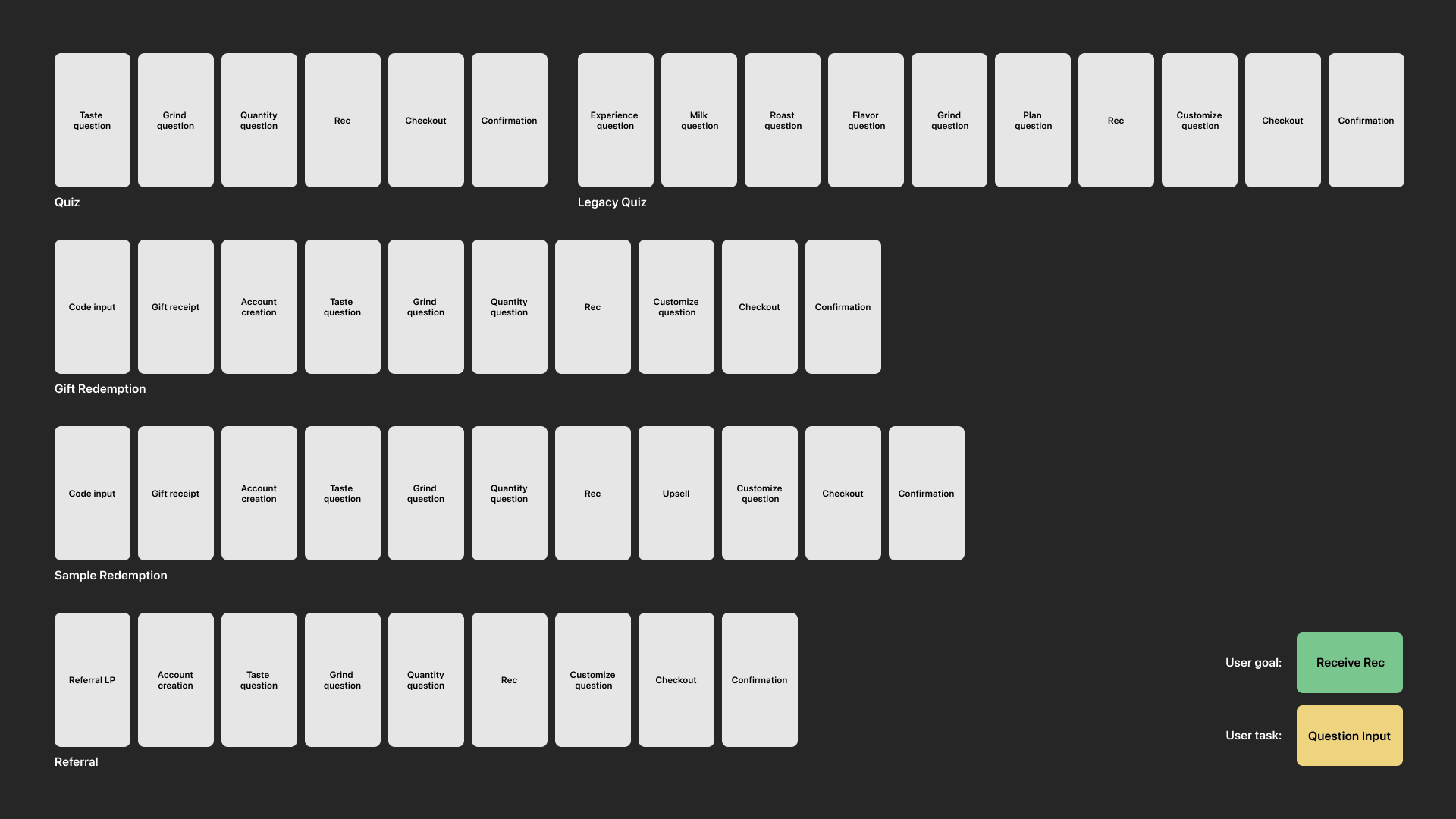
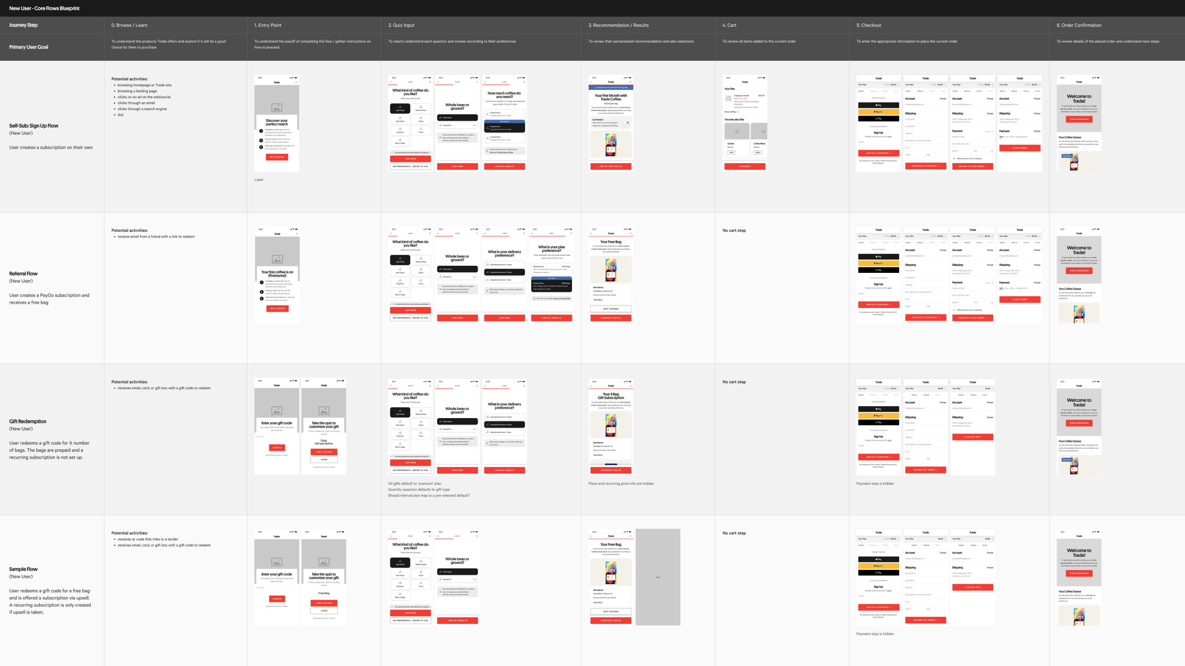
Map of the five different sign up flows, highlighting shared tasks and goals
Though the flows differed in terms of content and UI, they all were united in providing users with one objective: answering questions to receive a personalized product recommendation.
This allowed me to uncover a simplified journey that could streamline the flows while accounting for individual differences and specific user needs.
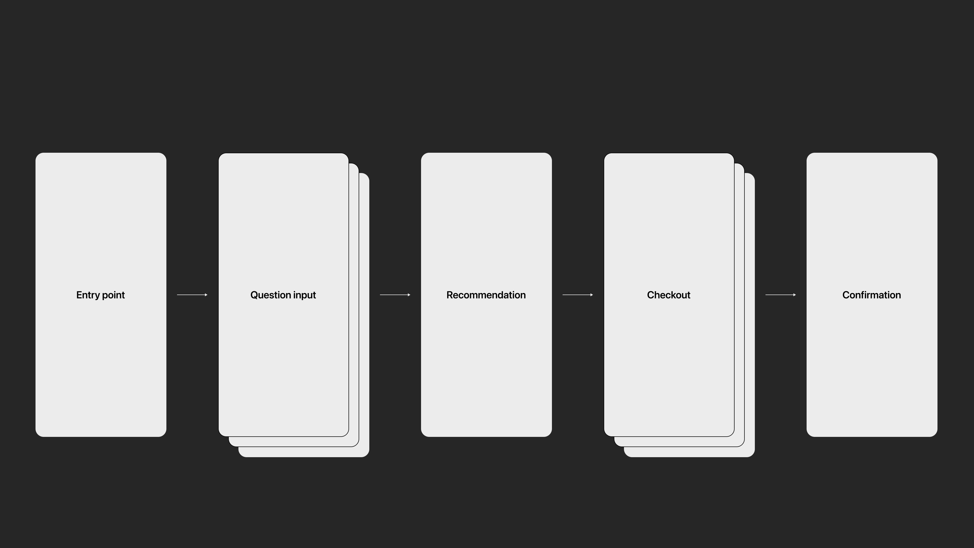
Simplified journey
Blueprint of the new journey across the flows
Testing & UX Improvements
We then got the flow with the highest traffic, the quiz, in front of users for testing. Specifically looking for patterns around their pain points, their confidence in their recommendation, and if we were asking the right questions to truly engage them.
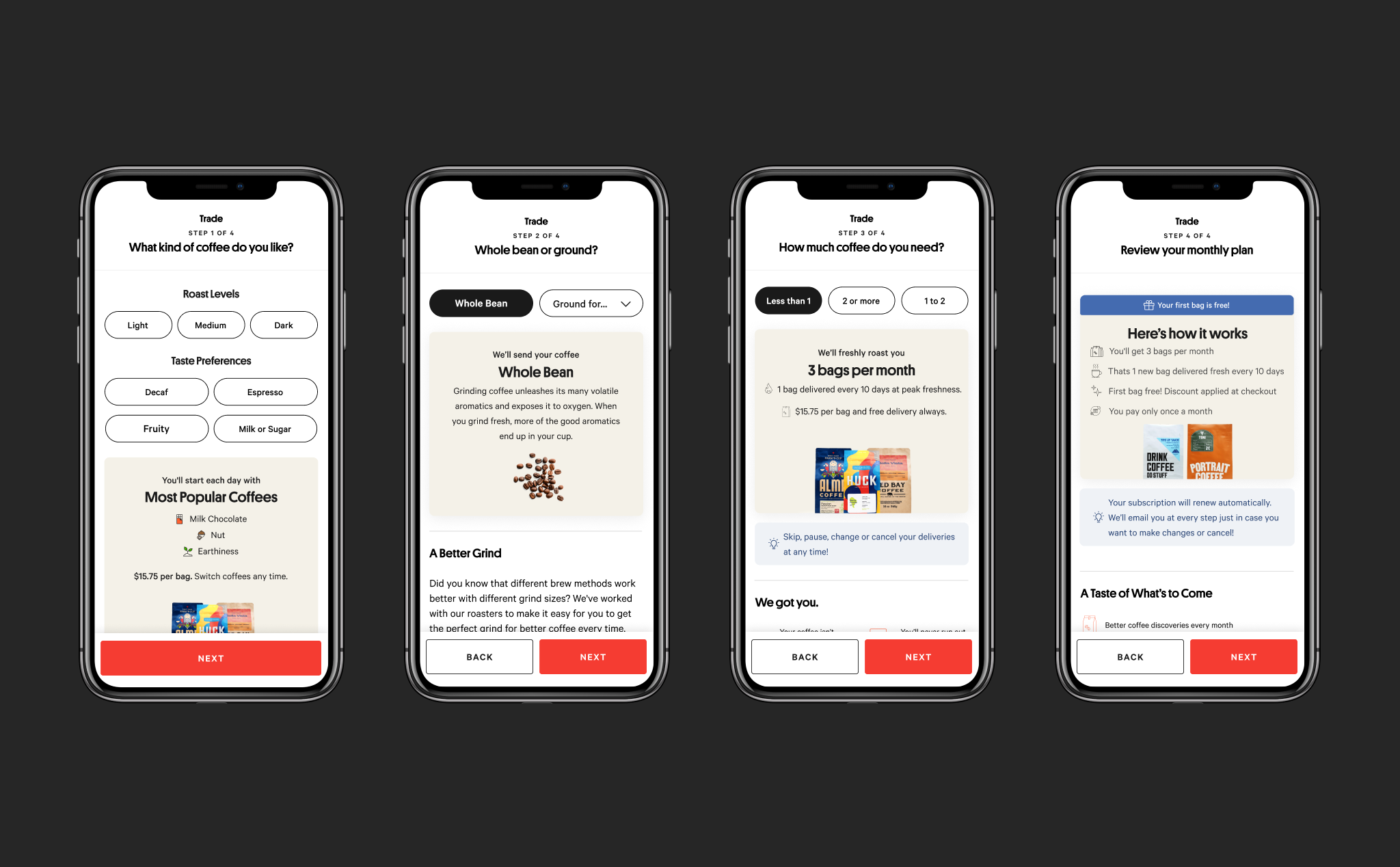
Current quiz flow
User testing takeaways:
- • Most users skimmed through the below the fold content.
- • Most users expressed confusion about what coffees they would receive.
- • Some users wanted to choose their own coffees.
- • Some users did not trust that the questions were detailed enough to give them a recommendation they would actually like.
Design Recommendations
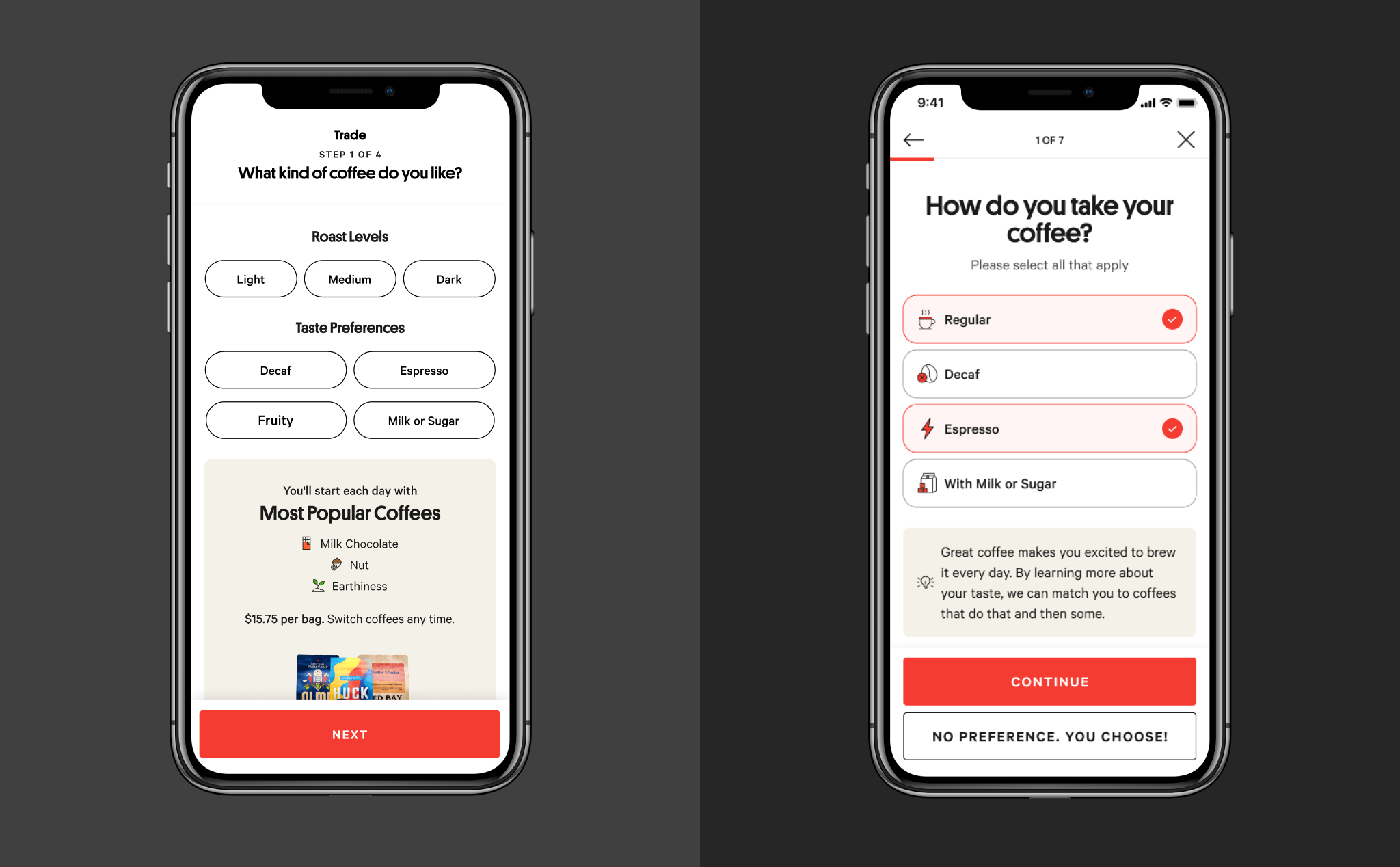
1. Add more questions/break out current ones
Boost customer confidence that the coffee matches they receive are a strong match to their taste preferences by adding more detailed and personalized questions to the quiz.
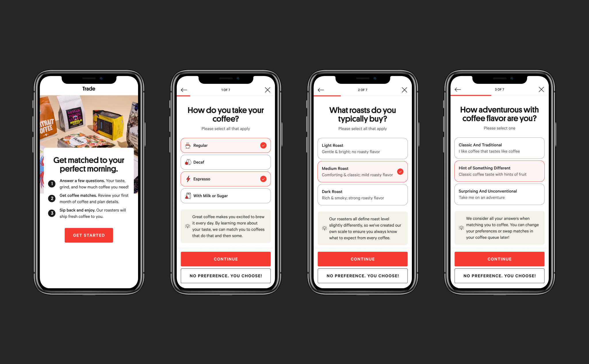
Breaking out the current taste questions to make them more focused and easier to answer.
Making the questions more personalized by including "Recommended for you" options depending on the customer's previous selections.
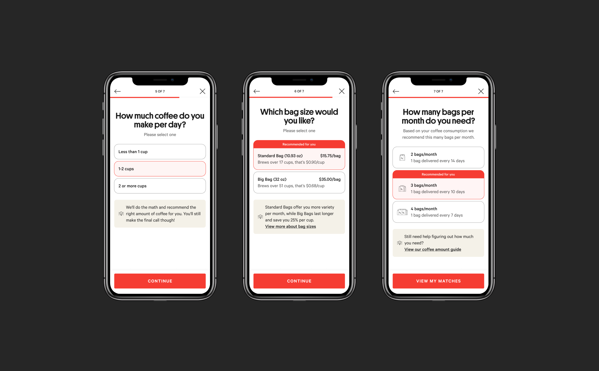
2. Start the quiz with an easy intro question
Intrigue the user with a simple, upfront question rather than a complex one to get them engaged. Futher reduce cognitive load by removing the below the fold content, and using the same templated layout and interaction patterns for each question.
Before and after comparison of step one
3. Show details of individual coffee matches on review
Reduce match uncertainty by explaining why coffees match a user's taste preferences.
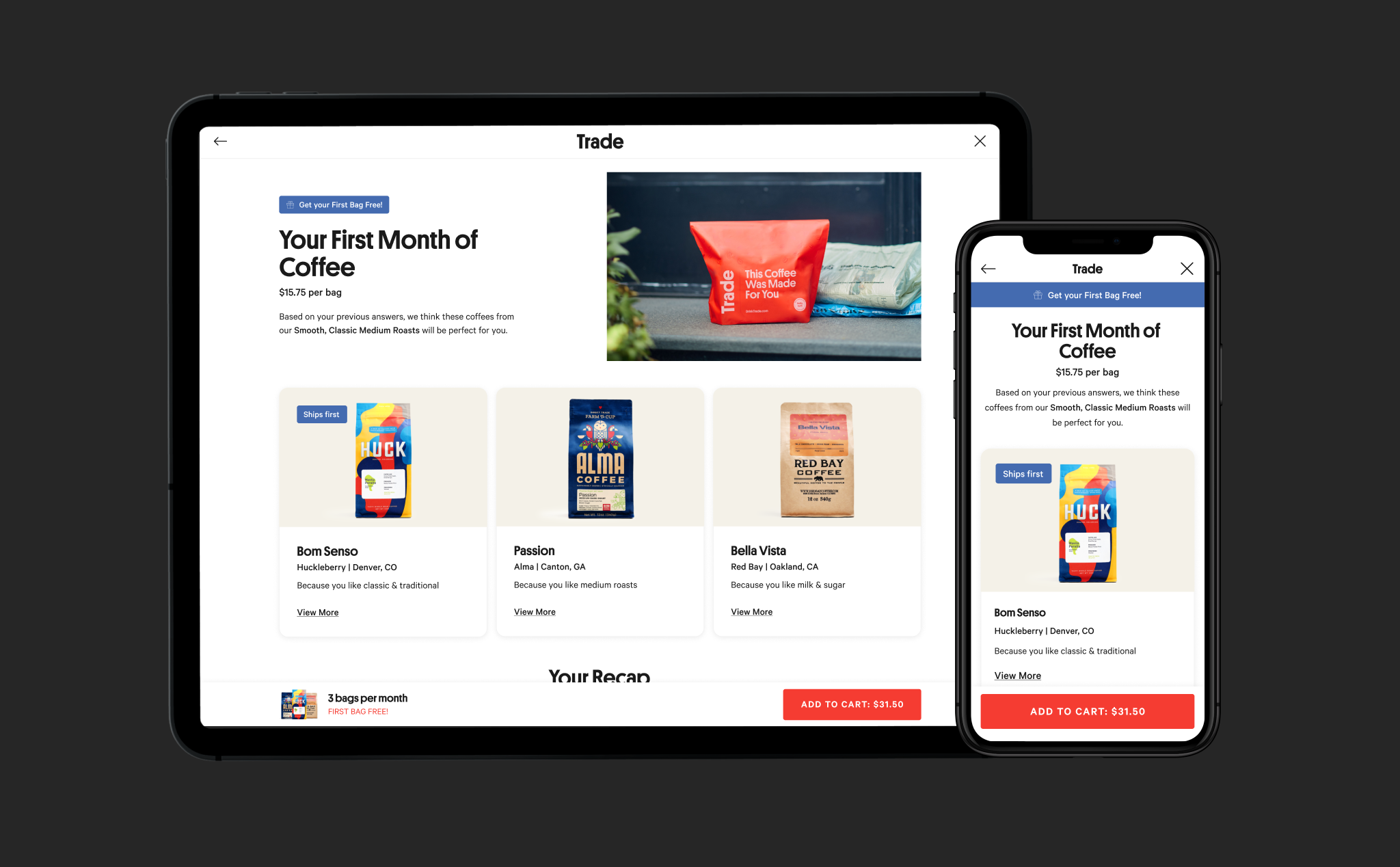
Improved design for product recommendation review screen, including individual coffee recommendations and why they match a user’s taste selections.
AB Test Results
Significantly lifted conversion rate by 11%
The new design increased quiz conversions by 11%. This was especially apparent on mobile which was lifted by 27%.
Dramatically increased quiz completion by 42%
The amount of customers finishing the quiz increased by 42%. Proving that customers were engaging more with the new set of questions.
20% increase in checkout started
We also saw an increase in the amount of customers starting to checkout after receiving their recommendation.

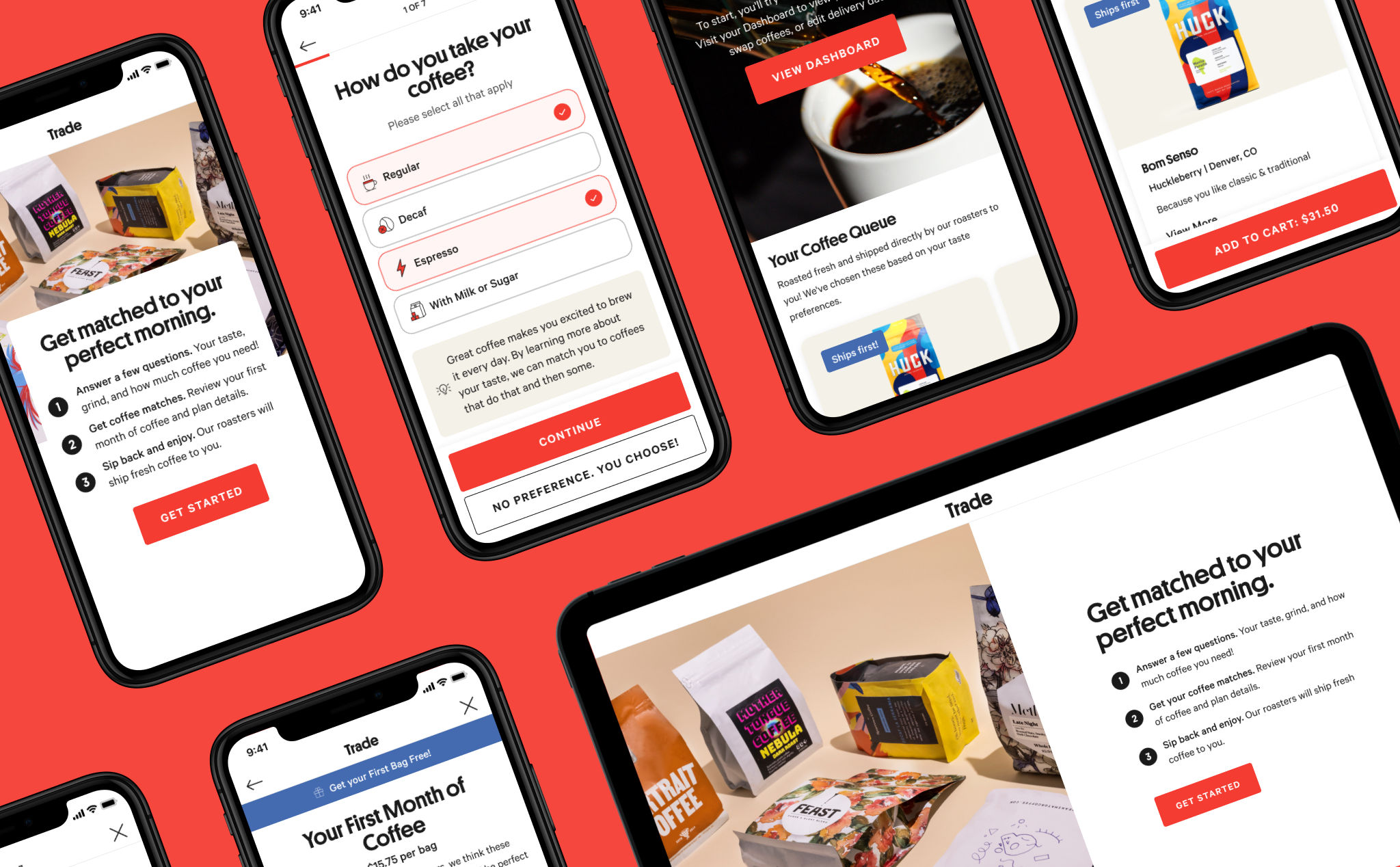
Final prototype and design of the improved quiz flow
Next Steps
I continued to collaborate with the Trade team to iterate on the quiz flow to further increase conversion and quiz completion. We completed a total of three design iterations and AB tests.
All together we were able to double the conversion rate of the quiz to a steady 15%. Most excitedly, this gave Trade a streamlined blueprint to improve the other subscription flows for customers across their platform.
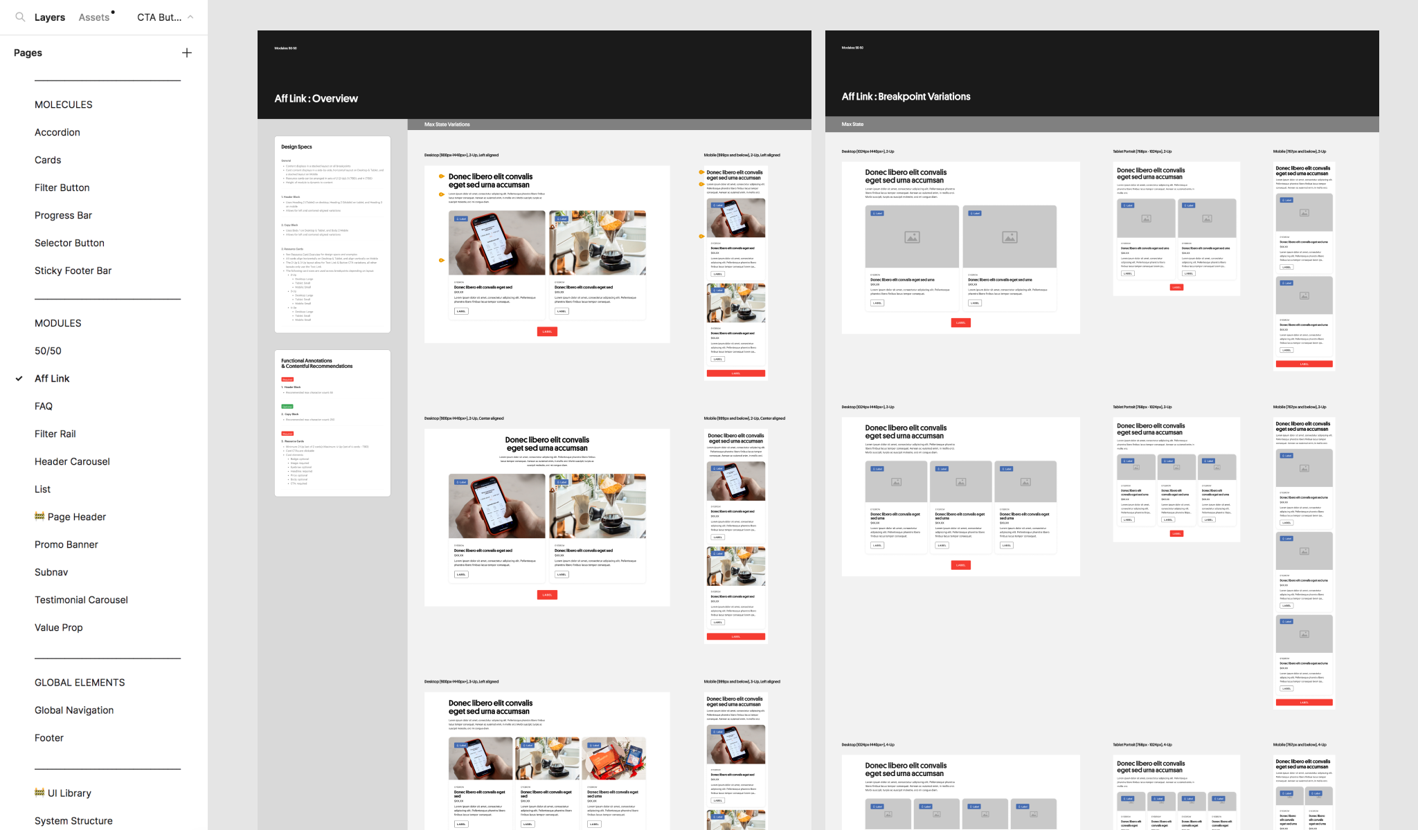
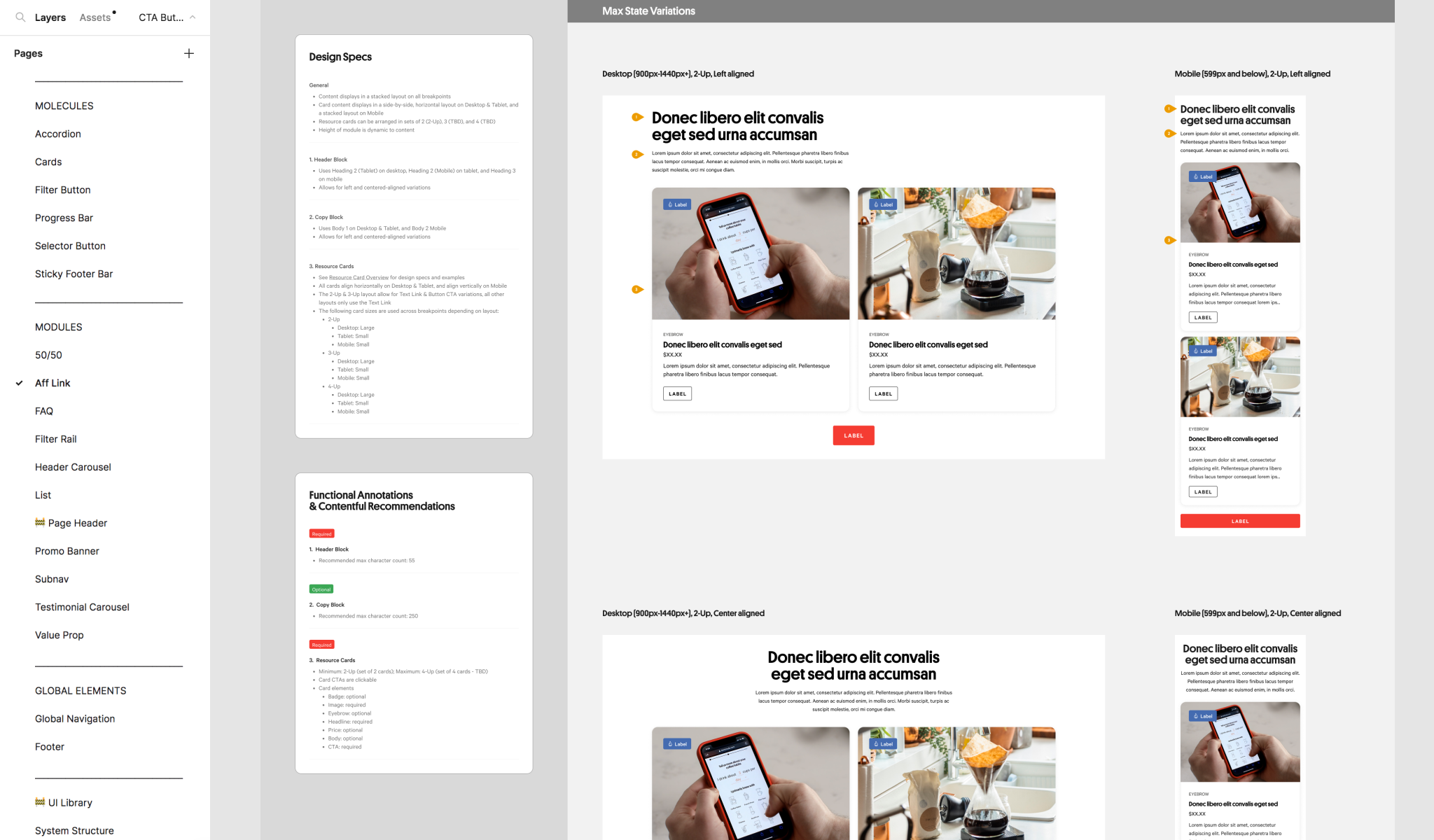
Design System
Creating a component library to guide design across teams, decrease development time, and scale Trade’s web platform.
I led the initiative of translating the new user side of Trade’s web experience into a flexible design system. The system spanned across the core experience and marketing landing pages enabling product designers, engineers, and marketers to contribute to design initiatives.
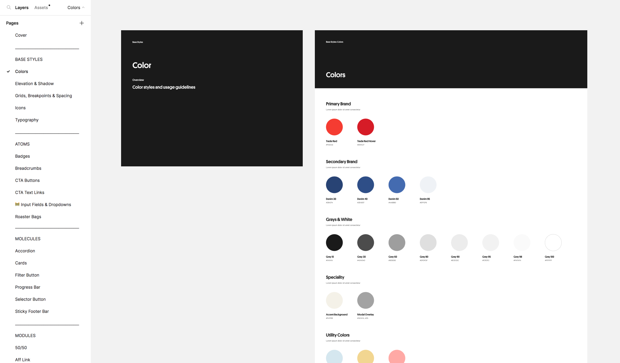
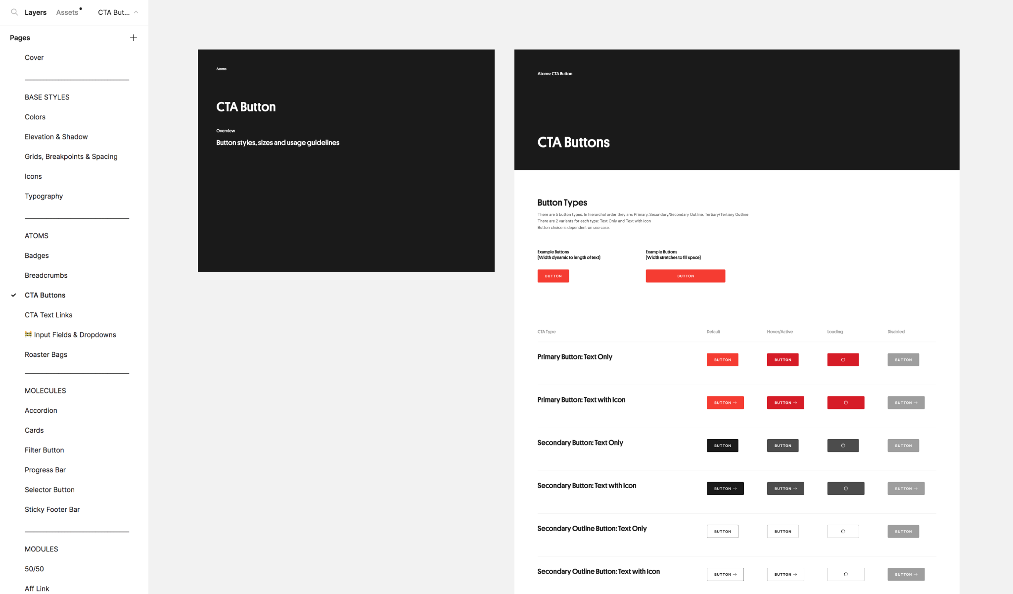
I created a working Figma file to house the system’s components and guidelines. The system consisted of multiple atoms and 11 content modules. Each element was documented with interactive and/or content states as well as breakpoints. Modules were also outlined with functional annotations and CMS content guidelines.